These photos are all from my new magazine. I took all of them during the construction of the magazine and edited them during this time.


These photos are an example of the ones I took for my contents page for the relationship part. I edited the picture I used to remove the background. I took the photo on a green background because it is easier to edit and remove the background. I made sure I used lights to enhance the colour of the ring and make it look professional.


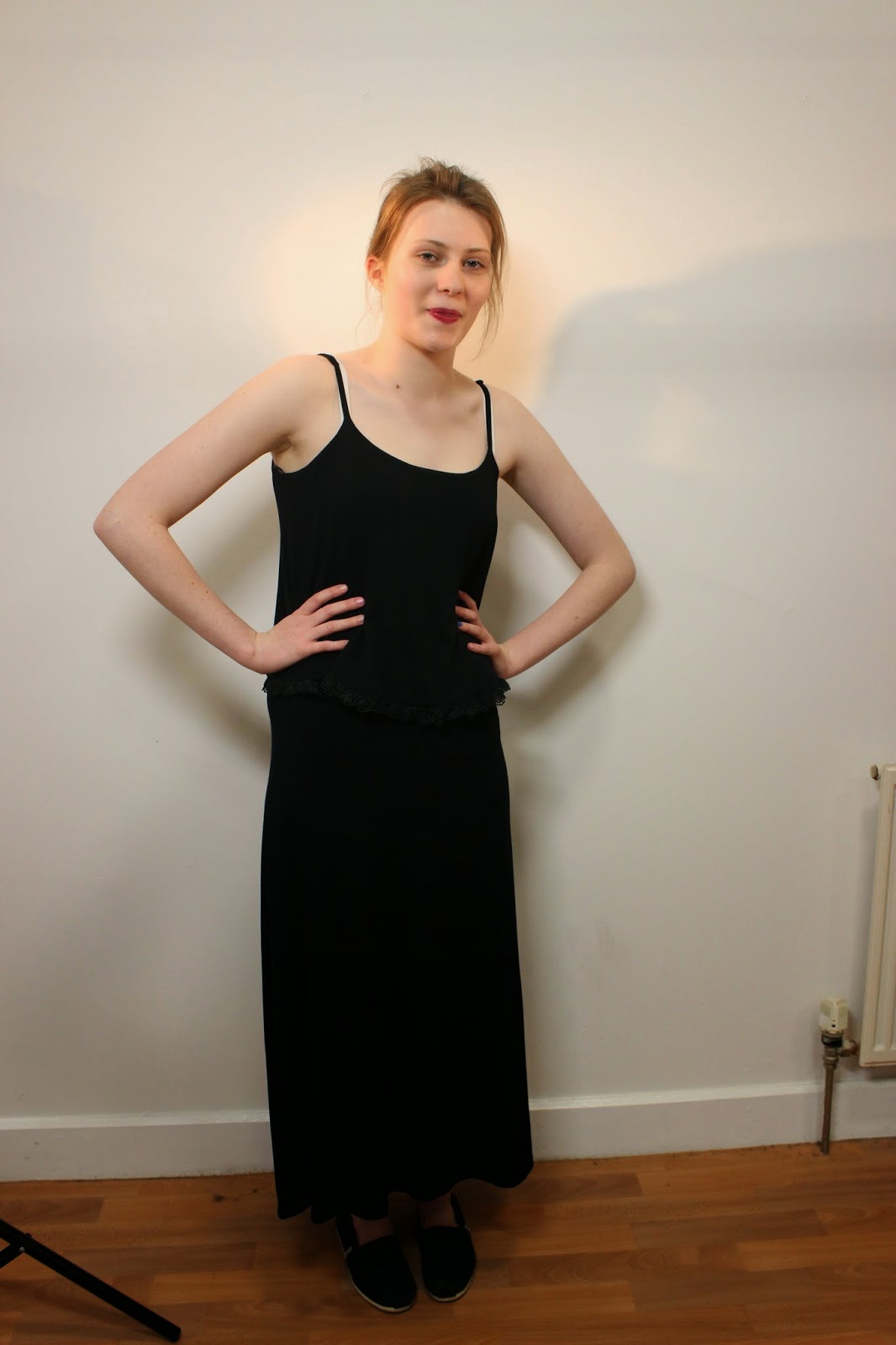


I decided to take a variety of photos from many different positions, backgrounds and lighting effects so I would have something to pick from ad take the best photo for my double page spread. This allowed me to have choice I my photos so I would have the photo that would suit the page layout. I wanted to see if I could create different moods and stories when changing the lighting and background. I decided to change the background part way through because I found that shadows were created and the lighting wasn’t be as good it is should be. I also found if I had one stable colour for the background I could better edit the pictures in Photoshop. I got the model to move in such as way it would look like a real life shoot for a pop music magazine. I wanted to get a combination of headshots and full body depending on what would best suit the page. After taking all the pictures, I choose a couple o the best shots and tried them on the page. I then found that the one I used conveyed the message and storyline I wanted it to, so I used this one.


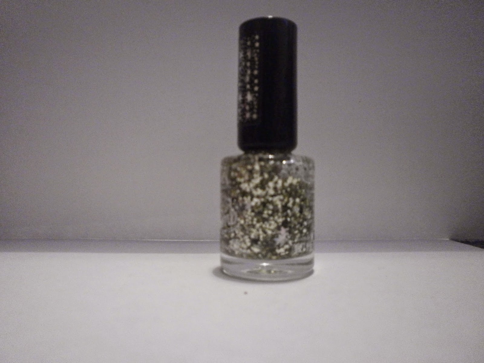
These photos are an example of ones I took for the context page to add to the effect. I made the magazine incorporate many different aspects that a young female audience would be interested in. I edited the final picture so the background was removed so it was transparent. I took the photo on a green background because it is easier to edit and remove the background. I made sure I used lights to enhance the colour of the lipstick and make it look professional.


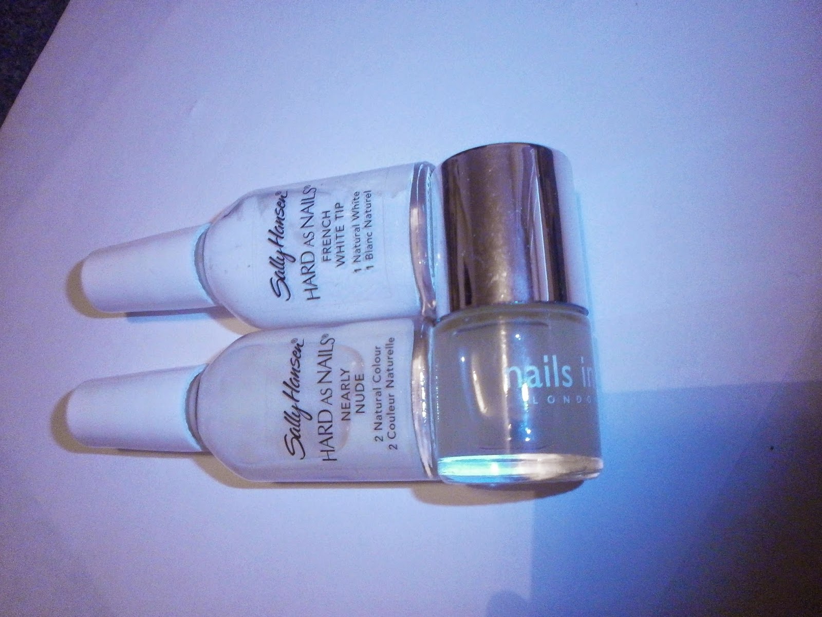

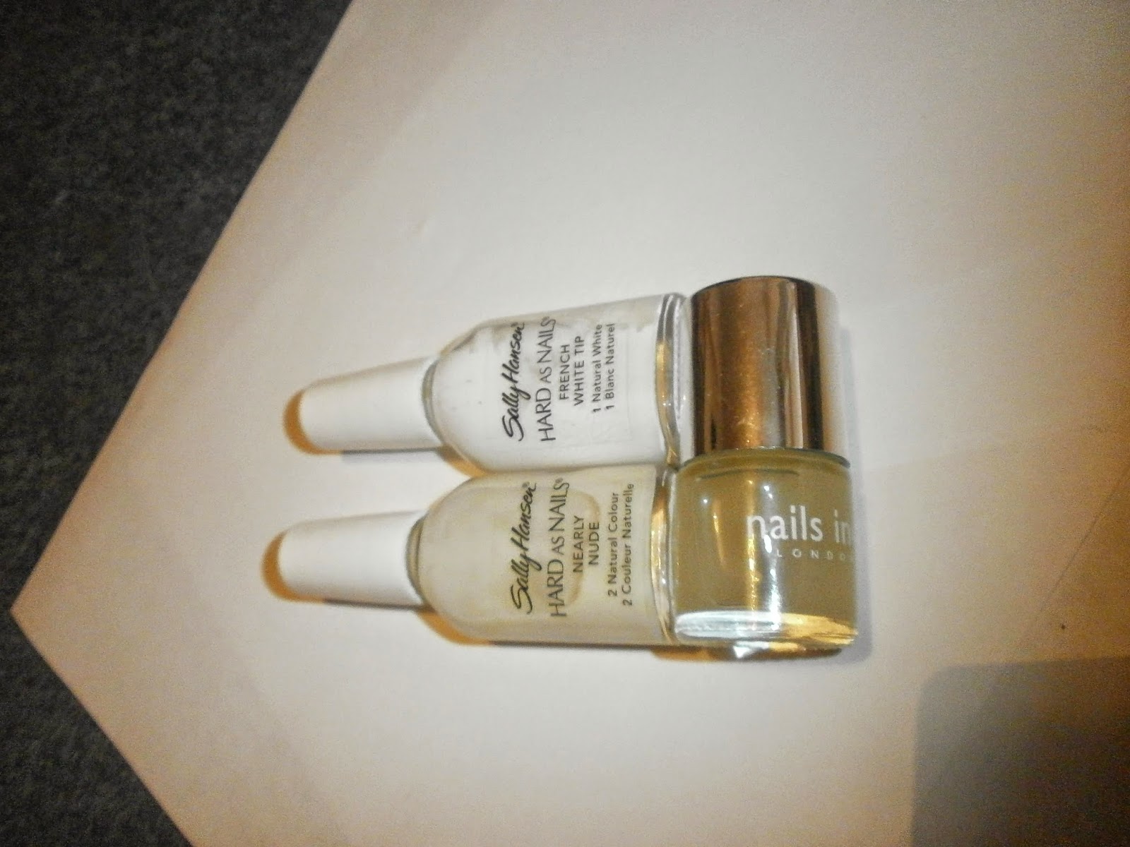
I took these without the help of
lights, I used natural lights to give the effect that a studio light may could
have given me. I did use one of these photos to fill some space in the make up
section of the content page. So the lights weren’t needed and this is why I didn’t
use them. I took a variety of different objects so I would be able to choose
what I want the page to look like. I was able to edit the picture I used to
have the best part it on show.


These are an example of pictures that I also used on my content page. I knew exactly the type of person and picture so I didn’t take much variety. I edited this picture to remove the background so I would be able to put another one on quark while creating the overall outline. I just got the model to change position slightly as I wanted to keep them in a direct address.


No comments:
Post a Comment